Building Relentless: From Name to Brand Identity
This case study explores the process of crafting a complete brand identity for “Relentless,” a software consulting company. We received the company name with the task of developing a logo, brand image manual, and overall brand strategy.
Understanding the Competitive Landscape

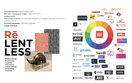
In-depth research was conducted to identify current logo design trends and their potential alignment with Relentless’ brand goals.
A competitive analysis was performed, gathering competitor logos and analyzing them for opportunities to create a distinct visual identity for Relentless.
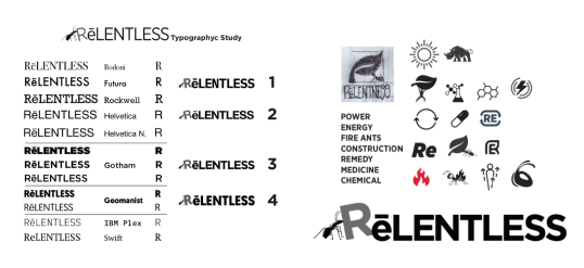
Semiotics, the study of signs and symbols, helped us explore imagery that could effectively represent the brand’s core values.
Crafting a Distinctive Brand Identity
Initial Logo Exploration
We explored a variety of typographic styles, including Serif, Sans Serif, Calligraphic, and Display fonts, to find the perfect match for the brand’s personality.
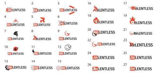
Initial sketches explored interactions between text and potential illustrations, fostering a cohesive logo design.


Client-Favored Logo Refinement
High-quality creative proposals were developed based on the research and initial sketches, allowing the client to choose a direction that resonated with their vision.
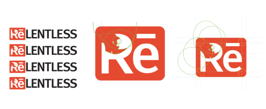
Following client selection, the chosen logo was refined, geometricized for clarity and reproduction, and finalized for various use cases.
Finalized Brand Mark
The final logo was delivered in a comprehensive file format package (jpg, png, pdf, etc.) to ensure flexibility across different branding materials.

Building the Brand Identity
To establish brand guidelines for using the logo effectively, we researched colors that complemented the chosen logo’s primary color palette.
Further research focused on current branding trends and competitor analysis to provide a solid foundation for Relentless’ brand strategy.
Mockups of branded materials, such as stationery or digital/printed advertisements, were created to demonstrate the logo’s integration and overall brand cohesiveness.
A comprehensive graphic identity manual was compiled, encompassing all the developed brand elements and guidelines for consistent brand application across various media.

Conclusion
This case study demonstrates our commitment to a collaborative and research-driven approach to brand development. We successfully transformed “Relentless” from a mere name into a fully realized brand identity, empowered to make a lasting impression.
